Each year, many of the major paint brands take their shot at predicting the color trends for the year. Everything from interior decor to fashion in 2024 is likely to reflect these color trends, but will there be a wildcard that nobody expects? Seeing how accurate the predictions are over the next year is all part of the fun! In contrast with the saturated color palette of 2023, the collections for the coming year have shifted once again towards more muted shades, indicating that soft pastel tints will be back in! Read on to learn which shades were this year’s top predictions for Color of The Year (COTY).
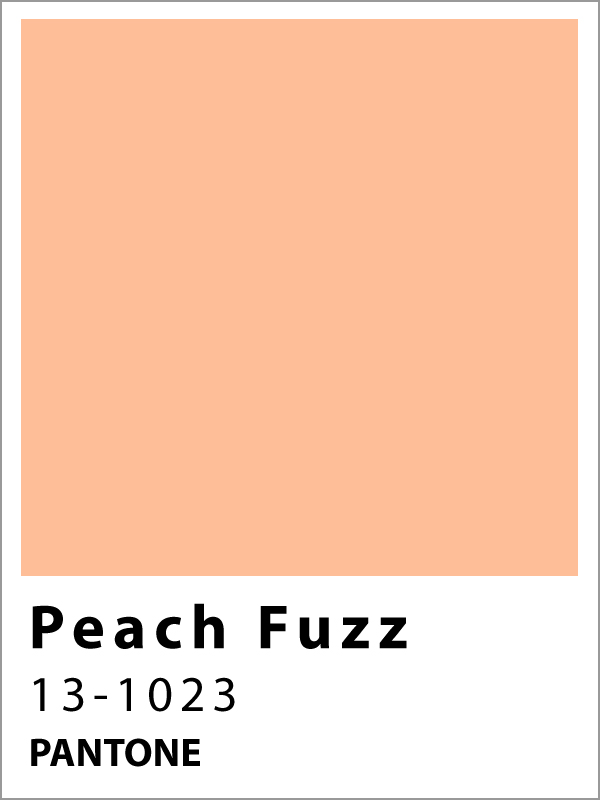
Peach Fuzz – Pantone
This soft pink tone, reminiscent of summer peaches, was described by the Executive Director of Pantone Color Institute as “A shade that resonates with compassion.” The warmth of the color makes it easy to use for the walls of any room. Either as the main hue or as an accent in the space, it will create a sense of gentle coziness that the team at Pantone believes is much needed this year. In choosing Peach Fuzz for COTY, they emphasized the necessity for a moment of respite in our fast paced world. Walking into a room painted with this color is like falling into the warm embrace of your home, giving yourself permission to relax and focus on your wellbeing.
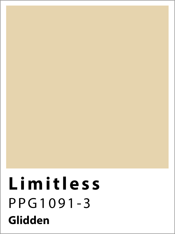
Limitless – Glidden
This color is being marketed by Glidden as a go-to neutral shade that will work in any combination to make a visually appealing color scheme. This is the limitless potential of the shade that they boast of through the name, while also linking it with the tagline “Call it anything but yellow.” Warmer toned neutrals have made a comeback for 2024, as reflected in the color palettes for this coming year, with the emergence of many muted hues from pink to orange. The Limitless color pairs well with all of them, even if we might still have to call it… a pale yellow.
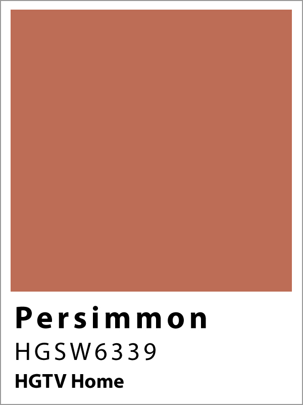
Persimmon – HGTV Home
Keeping with the theme of warm neutrals, Persimmon adds a slight spice of pink and clay-toned orange to the popular beige with which we are all accustomed. This hue was described in a statement from the company as balancing “the energy of tangerine with grounded neutral undertones” which makes it perfect for the walls of your kitchen or living room. It pairs well with other muted pastel shades, as well as the earthier tints of their 2024 Color Collection, and is said to promote conversation and positive relationships.
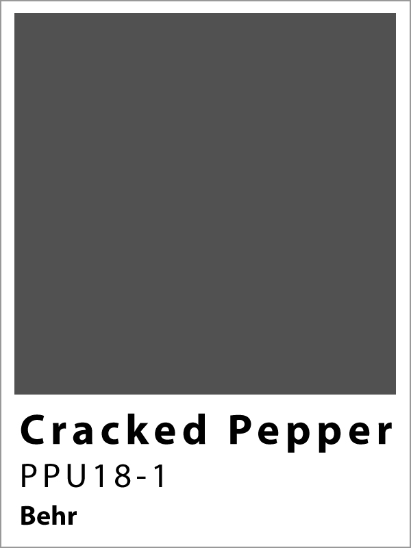
Cracked Pepper – Behr
This stand out color from Behr is an edgier, moodier choice for COTY, intended as an alternative to classic white and beige neutral hues. If you’re looking for a bold choice that is guaranteed to change the feeling of an interior, this soft black will redefine a room. Due to its versatility this black pairs well as an accenting color with any of the other nominations or collections of this year.
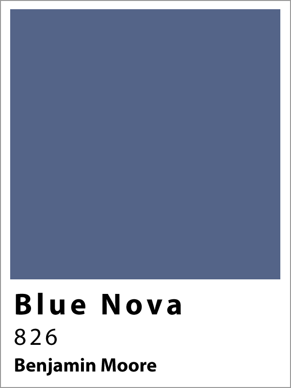
Blue Nova – Benjamin Moore
A shade that is said to capture the beauty of space and mark the beginning of a new era of exploration is Blue Nova. This COTY nomination was made in partnership with the company Blue Origin, led by Amazon founder Jeff Bezos, and announced at their orbital launch site. The deep, cool toned blue is slightly violet-tinged falling into the mid-blue spectrum. It is a bold choice when used for interiors, with a tendency to demand the attention of the room. It pairs well with burnt-orange in a complementary color scheme, or with the more muted, earthy hues of their 2024 color palette to provide an impressive pop of color.
Upward – Sherwin Williams
As described by Sherwin Williams, “This denim blue with calm gray undertones will have you dreamily adrift in the stratosphere.” This icy neutral toned blue works well with a variety of cool pastel colors for a pleasant, tranquil atmosphere, or pair it with frosty whites to brighten a room and give it an open, spacious feel. COTY predictions from Sherwin Williams are normally accurate, and it doesn’t seem that they will miss the mark this year either, with the emergence of several muted blues as COTY nominations by various brands.
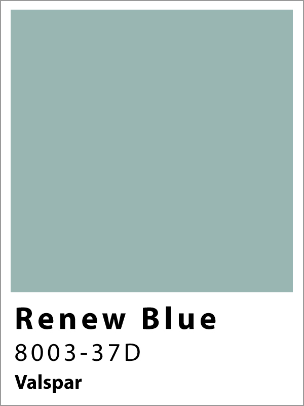
Renew Blue – Valspar
Maintaining the growing theme of muted blues for COTY is Renew Blue from Valspar. This is another cool, icy blue color with slight green undertones. Sue Kim, the Director of Color Marketing at the company indicated that the chosen shade of blue was inspired by “fleeting elements” of the natural world, such as “fog, mist, clouds, and glacier lakes.” This year’s choice represents a shift in the acceptance of blue as a new found neutral tone in many modern homes. With this in mind, this shade was chosen for its ability to pair well with a variety of different styles, while also creating an open feeling within a space by mimicking colors of the natural environment.
Looking For A Home?
Check out these active listings!
5250 Pease St
$324,900
2 Bedroom – 1 Bath
1,111 Sqft – Built 1925
8308 James Franklin St
$343,000
4 Bedrooms – 2 Full & 1 Half Baths
2,084 Sqft – Built 2023

