Benjamin Moore’s Color of The Year 2025


Cinnamon Slate
The focal point for Benjamin Moore’s 2025 color palette and their nomination for the next Color Of The Year is called Cinnamon Slate, with the ID of 2113-40. This understated purple tone has been described as a delicate mix of heathered plum and velvety brown, which can bring a smoothness and sense of familiarity to any space. Spokespeople from the brand have indicated that the color was derived from a more emotional level this year, citing a societal need for both balance and reassurance. Restorative colors are those that impart positive feelings such as calm, peace, or happiness upon viewers of the hues, granting these colors a quality that helps to restore our moods.
Cinnamon Slate was created to embody a sense of yearning for comfort and the sense of being surrounded in calm. Like previous colors of the year, Blue Nova and Raspberry Blush, Cinnamon Slate retains a similar sense of confidence to the previous colors, while also retaining a more understated and nuanced feel. Benjamin Moore recommends pairing the Color Of The Year with neutral toned whites such as Cloud Cover (OC-25) or Calm (OC-22). Other great pairings are the soft pink of Porcelain (2113-60) and the deeper purple tone of Chambourd (AF-645). These shades all look great when paired with textured and neutral toned items or textiles within the space of a living room.


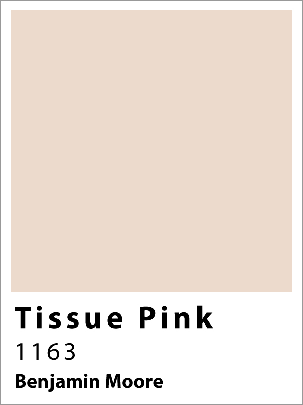


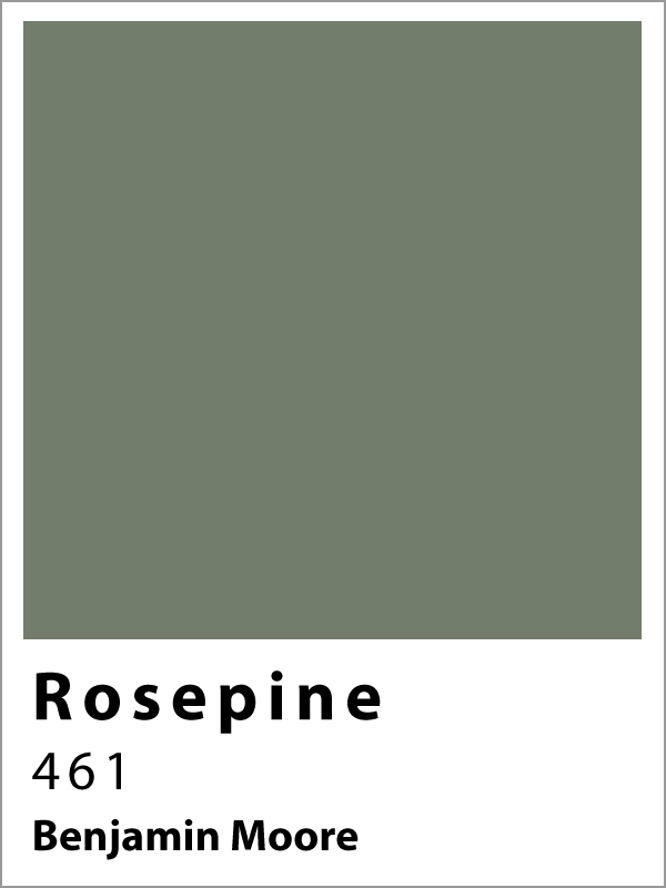


The full 2025 color palette from Benjamin Moore includes ten soft, quietly colorful hues. These shades are meant to fall in the range of color that is difficult to define. These blends of color exist somewhat in between two tones, such as purple and brown with Cinnamon Slate. The undertones of this palette are consciously crafted so that the colors can be paired with items or other colors to bring out either more of the warmth within the paint, or to reflect a more neutral tone when paired with brighter shades and cooler hues. The 2025 palette is intended to check all the boxes for paint colors that you would want to decorate an entire home. Tissue Pink is a warm and inviting hue that works great in an entryway, while Cinnamon Slate continues the warm vibe while adding extra layers of richness and depth that make it perfect for a living room. The brighter Rosepine pairs well with the muted green of Ashwood Moss to create an interesting mix of greens that can be applied to a kitchen and dining room space to bring the two together. Transitionary rooms such as hallways and staircases go well in the neutral Sea Salt. Glacier White can be saved for a bright, open feeling in a bedroom, which their Stained Glass tone pairs nicely with in a color drenched bathroom.
Looking For A Home?
Check out these active listings!
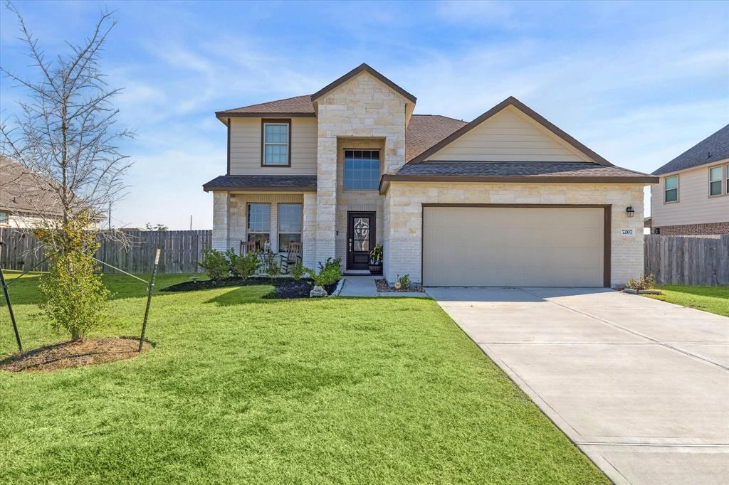
7207 Hillside Ave
$455,000
5-6 Bedrooms – 3 Full & 1 Half Baths
2,770 Sqft – Built 2022
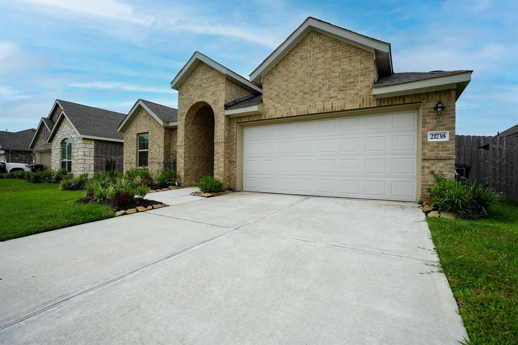
21738 Thicket Point Lane
$275,000
3 Bedrooms – 2 Full Baths
1,922 Sqft – Built 2022
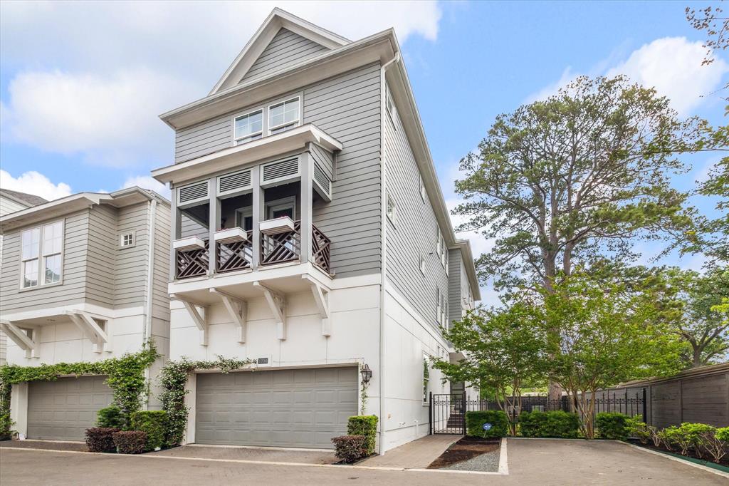
1730 W 23rd Street
$849,900
3-4 Bedroom – 3 Full & 1 Half Bath
3,545 Sqft – Built 2016
102 Portland Street
$950,000
8,375 Sqft lot
502 W Francis Street
$265,000
3 Bedroom – 2 Full Baths
1,464 Sqft – Built 2024


